Nordica
- Brand Identity
- Brand Strategy
- Touch Points
- Website
Year
2019
Claiming a spot in Antwerp’s thriving food scene is quite the challenge, but Nordica has gracefully navigated this path by combining authenticity, unique branding a distinct culinary approach.
Year
2019
NORDIC TOUCH
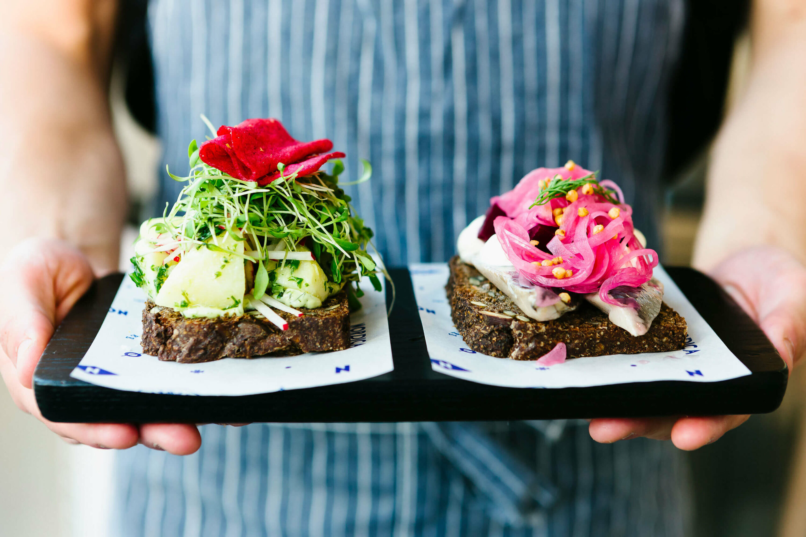
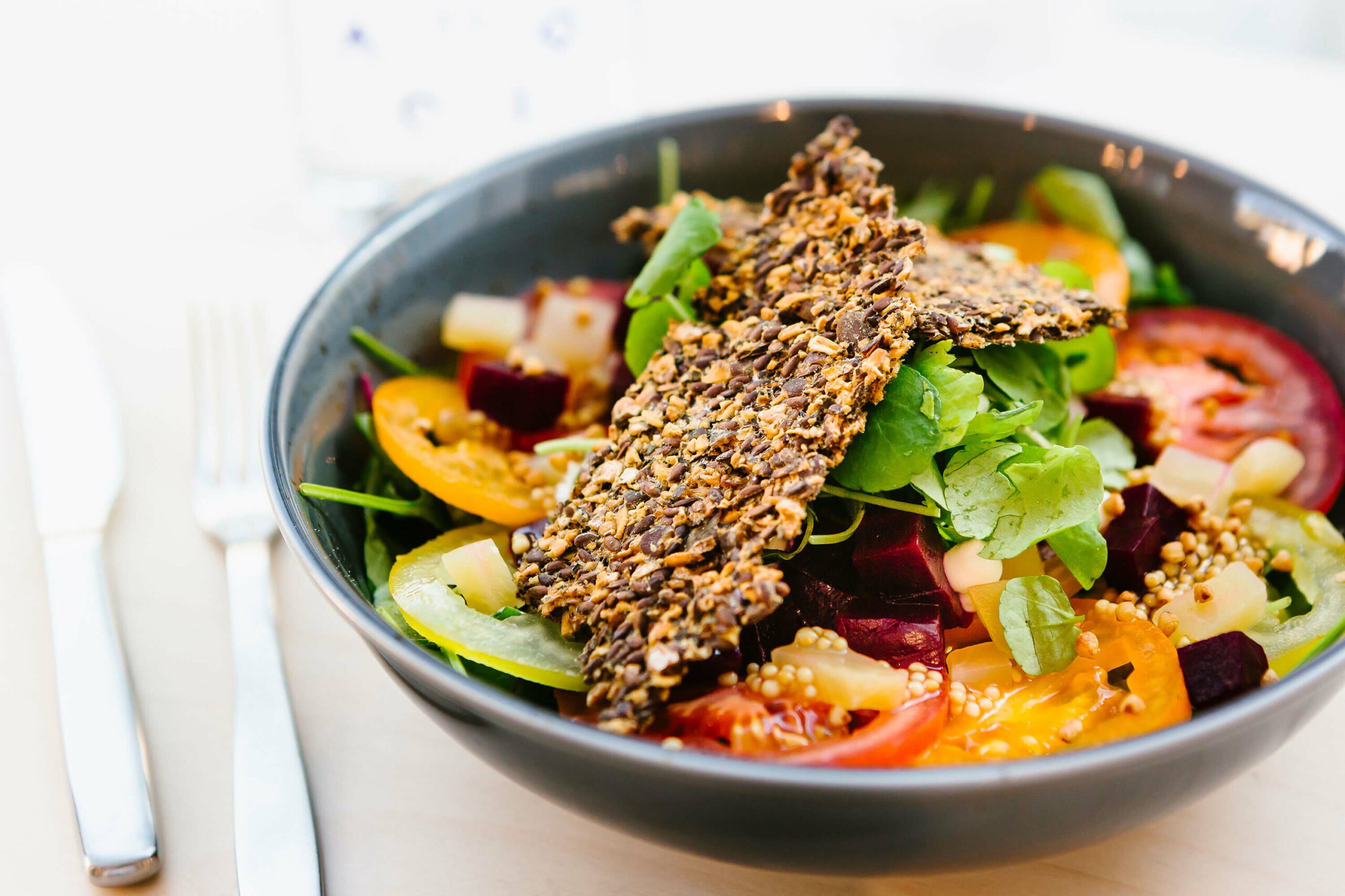
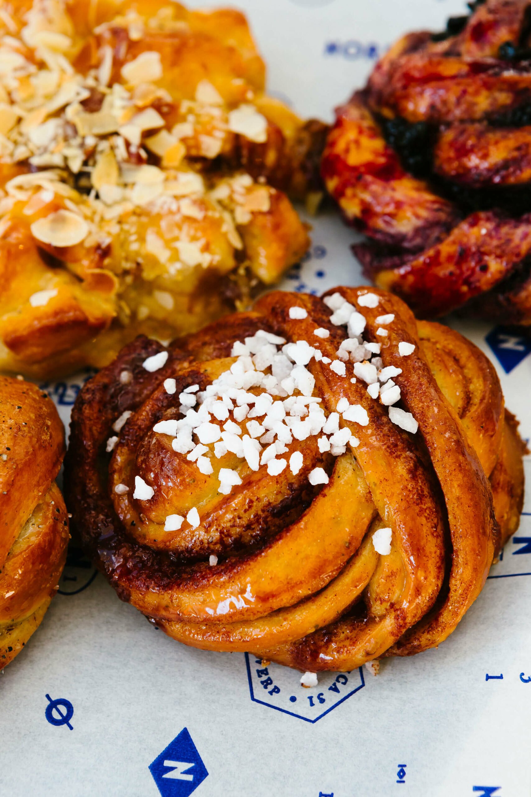
Enter the captivating world of Nordica, a beloved destination for foodies seeking a Nordic-inspired culinary experience. Inside, you’ll find mouthwatering dishes infused with a distinctive temporary twist, all within a cozy and minimalist ambiance.
carefully curated
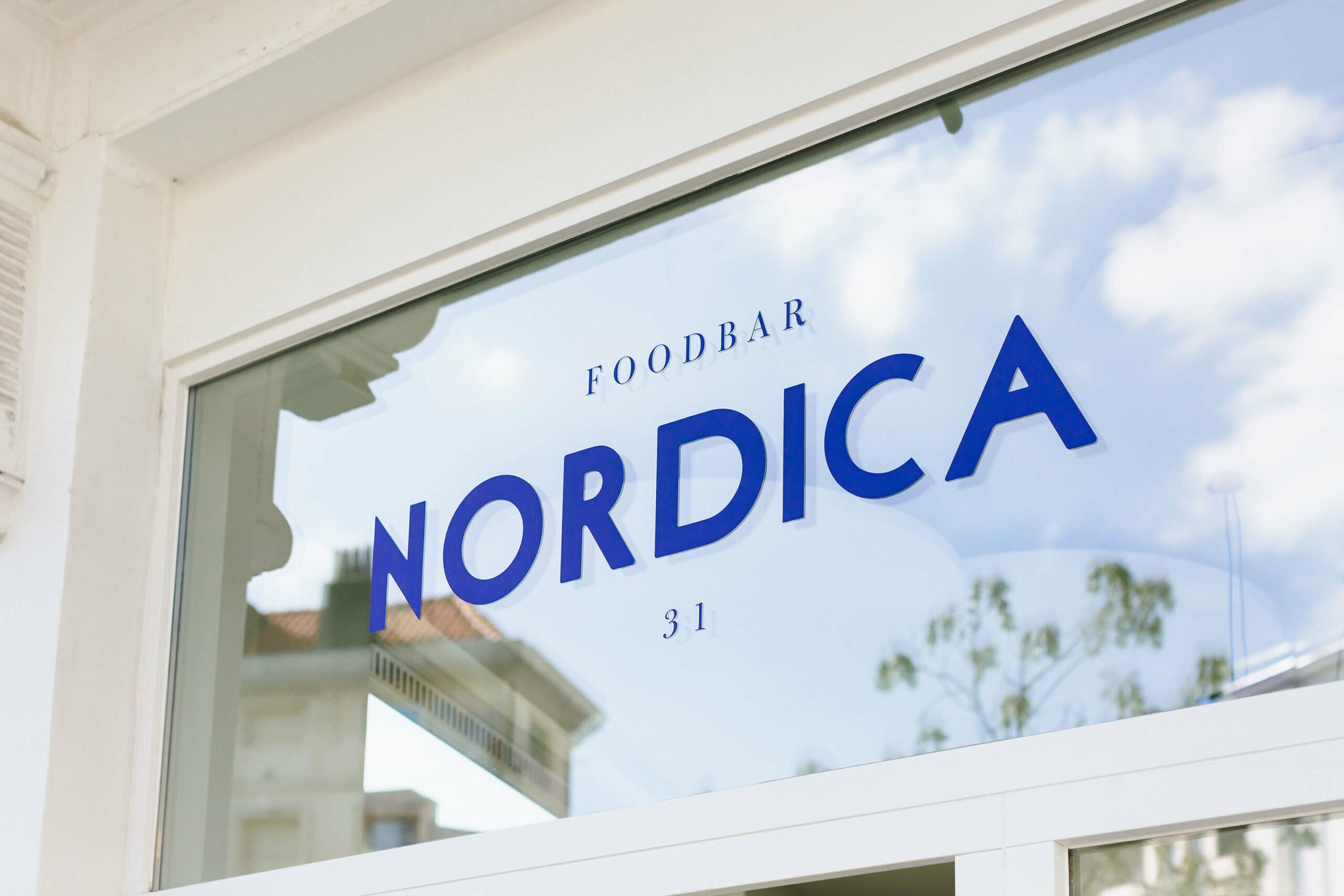
To set them apart, our creative journey began by delving into the rich Nordic heritage, cherry-picking elements that resonated with us to infuse into the branding. This mix between contemporary flair and authenticity perfectly mirrors the approach they take with their culinary creations.
eye-catching COLORS
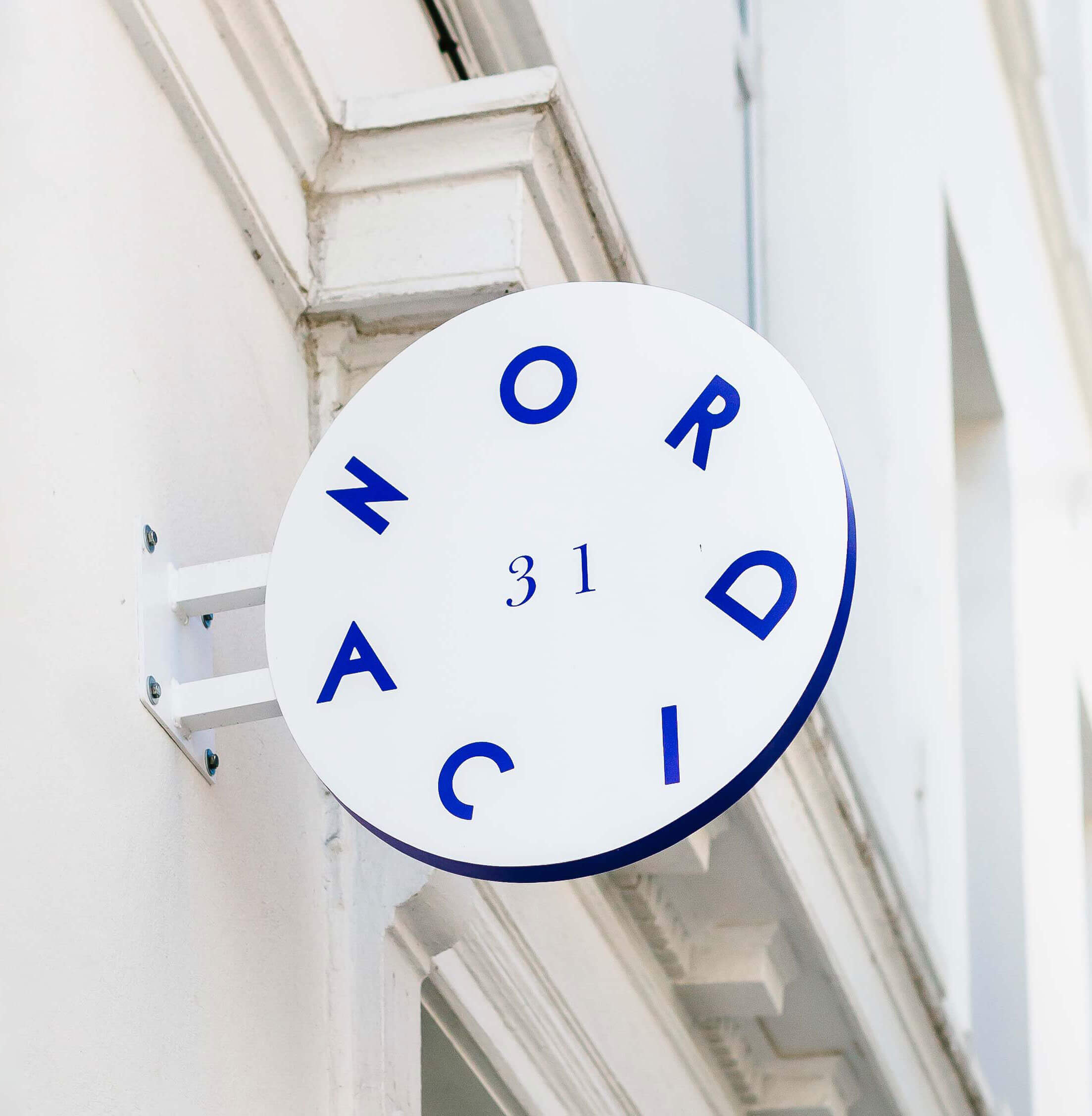
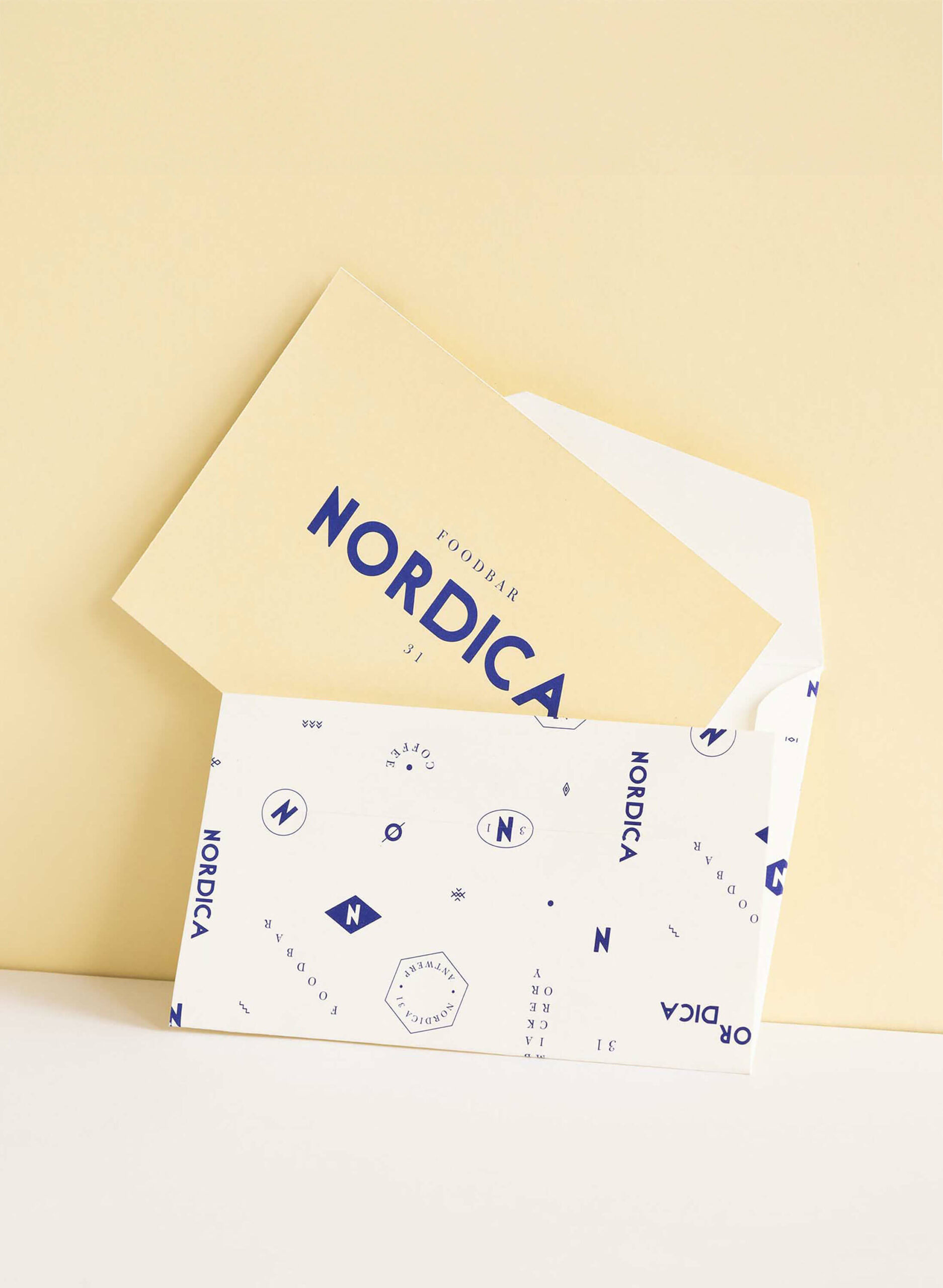
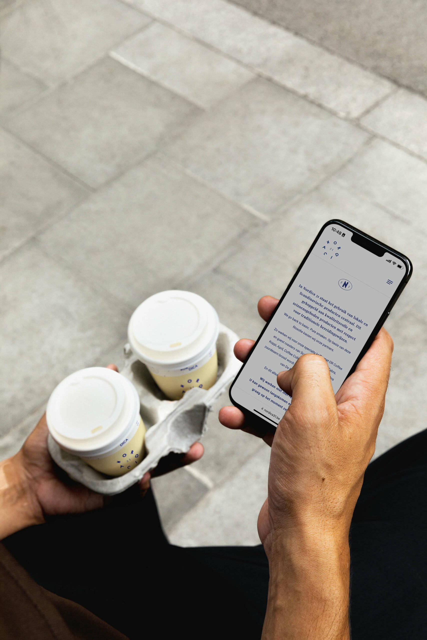
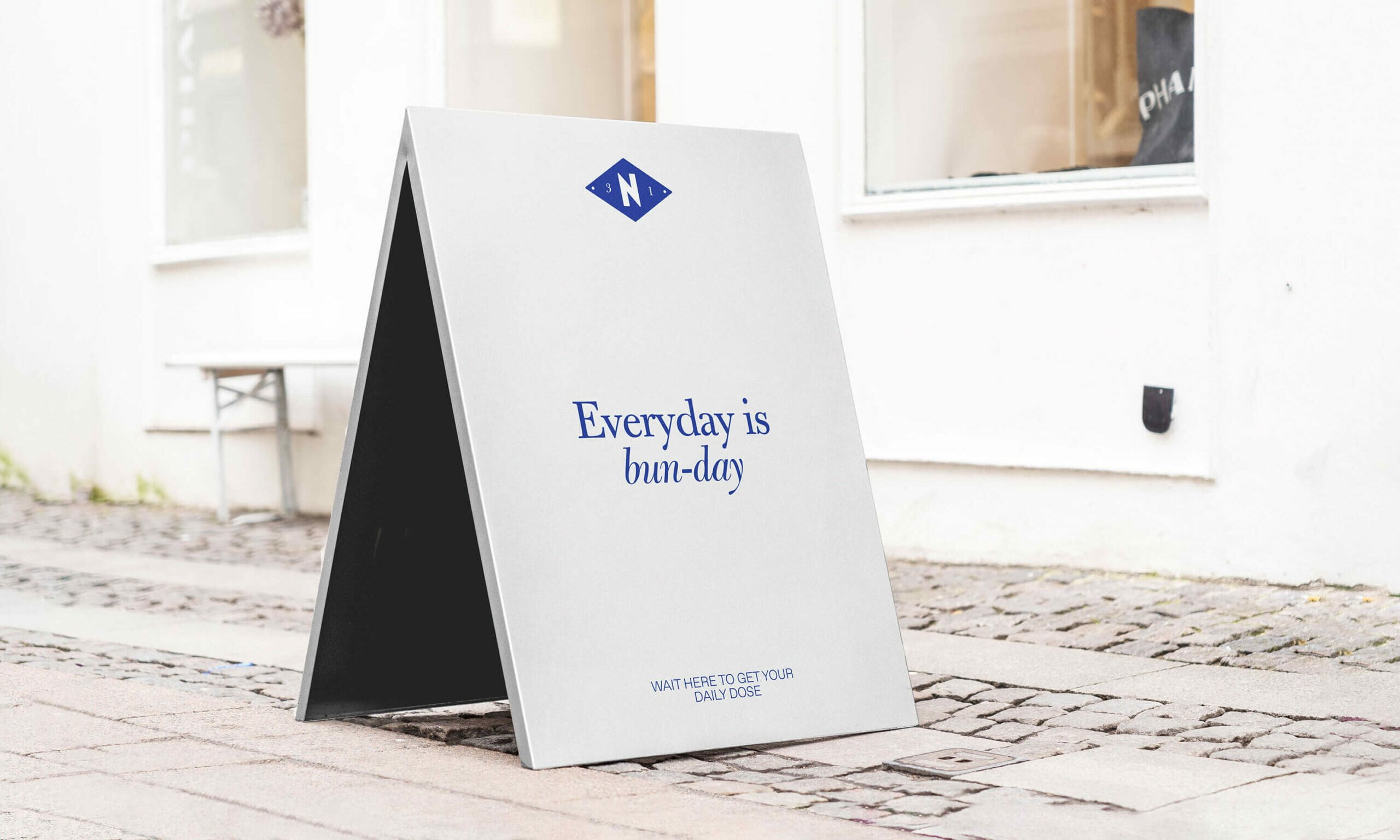
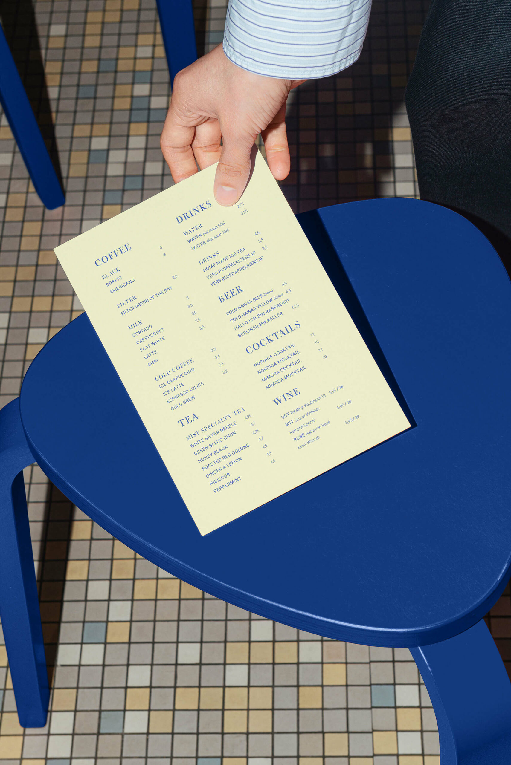
We decided to work with only two colors, a soft light yellow and a vibrant cobalt blue. All of their branded material wear either one or both of these colors. Making the visual identity cohesive and instantly recognizable, even from a distance.
THE PERFECT FUSION
The logo and accompanying typographic elements have been expertly created using a combination of a bold font with a graceful serif, shaping a perfect fusion between modernity and timelessness. Their pattern is a clear illustration of this beautiful harmony.
GOOD VIBES
When looking at Nordica, you can’t help but feel good. Happy colors, playful typography and the best Nordic sweets. It’s really true what they say: good food = good mood (or as they like to say it: God mat – Godt humør).
Credits
Photography — The Fresh Light
Videography — Arnaud Leclef
