Harvie
- Brand Strategy
- Brand Identity
- Art Direction
- Touch Points
- Web Design
- Website
Year
2023
Eric has been around the food industry block. And each time, he was stunned by the mountains of perfectly edible food that gets tossed out like it’s nothing. Food that was still good – just a bit wonky. He knew something had to change…
Year
2023
NEW KID IN TOWN
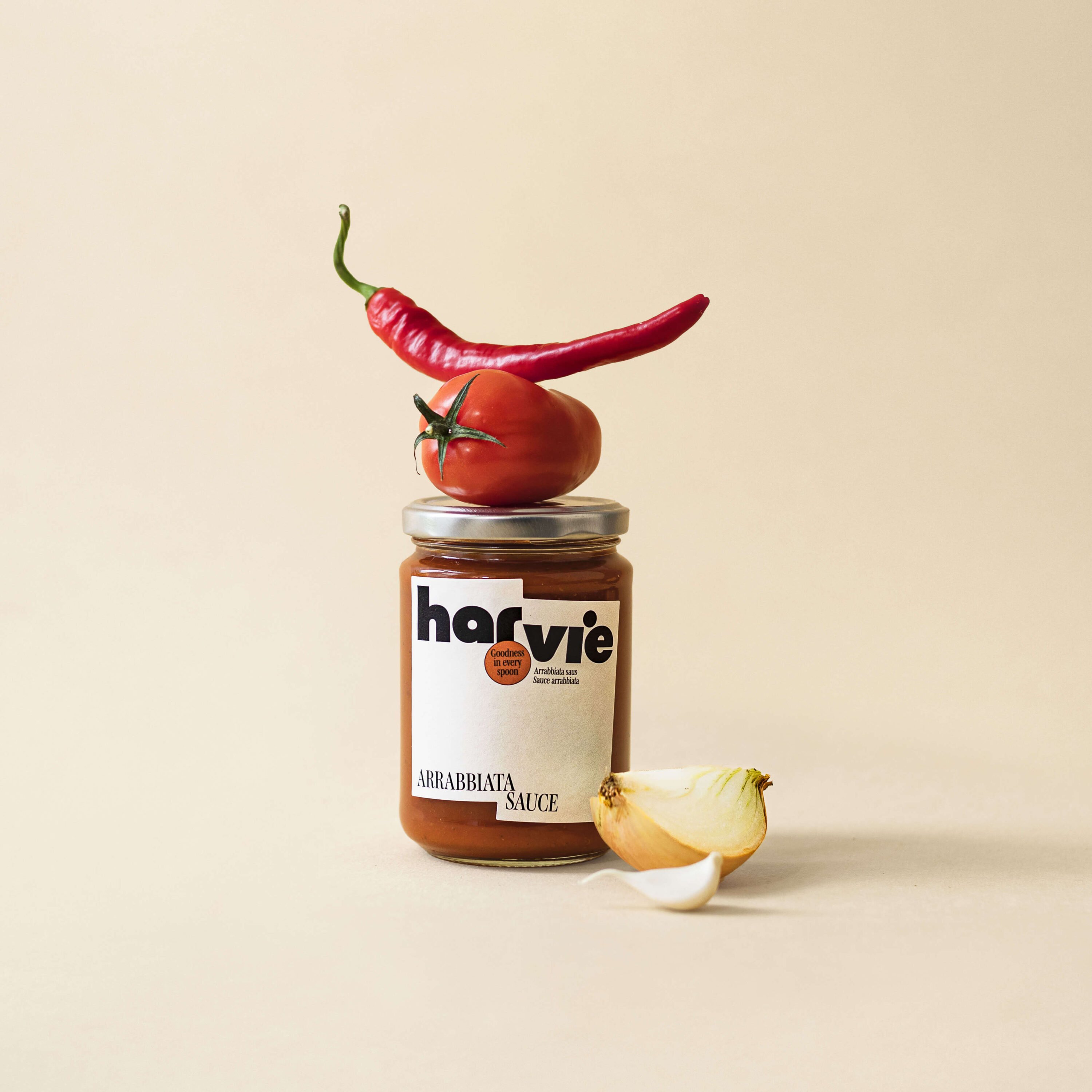
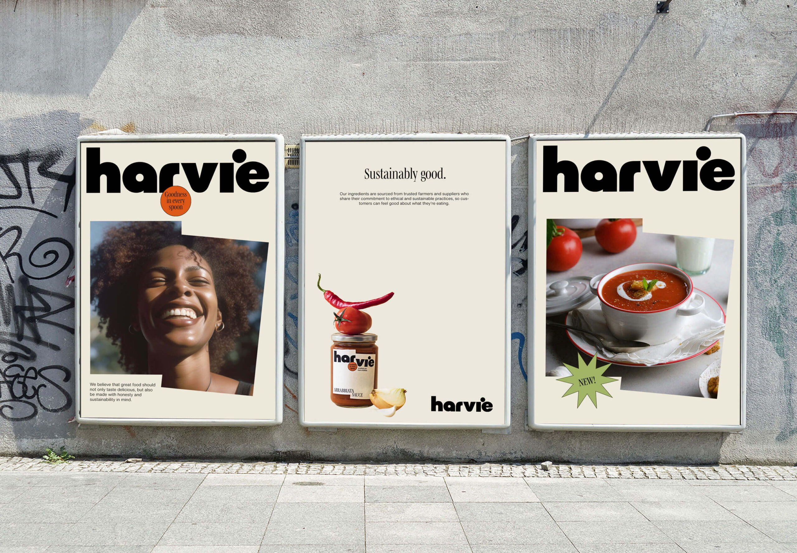
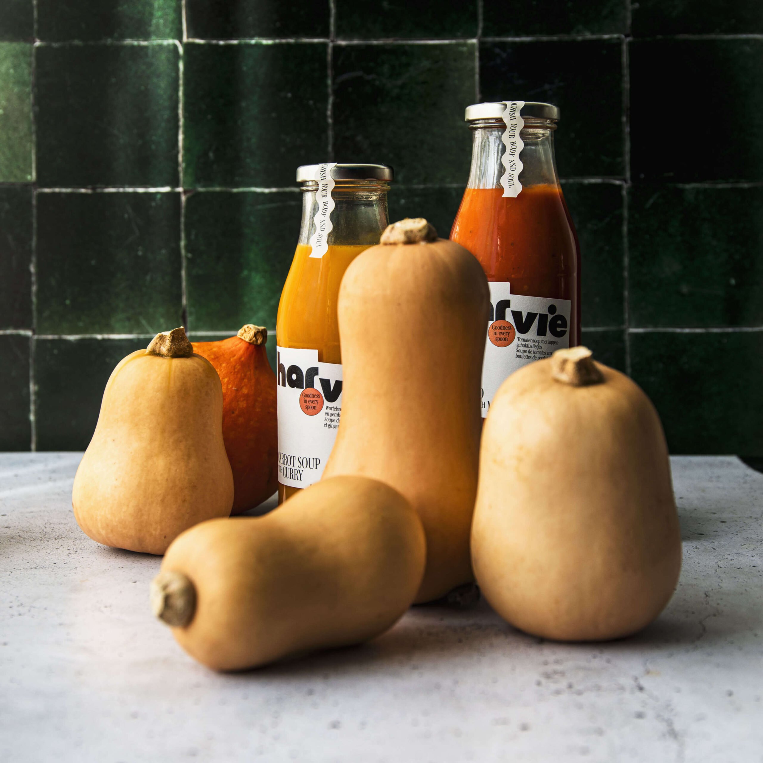
Meet Harvie! A soup and sauce label that’s committed to sustainability and quality. They only source the freshest, most environmentally friendly ingredients from trusted farmers and suppliers. No artificial flavorings, colorings or preservatives.
It’s tasty and honest food that nourishes both body and soul.
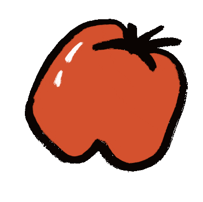
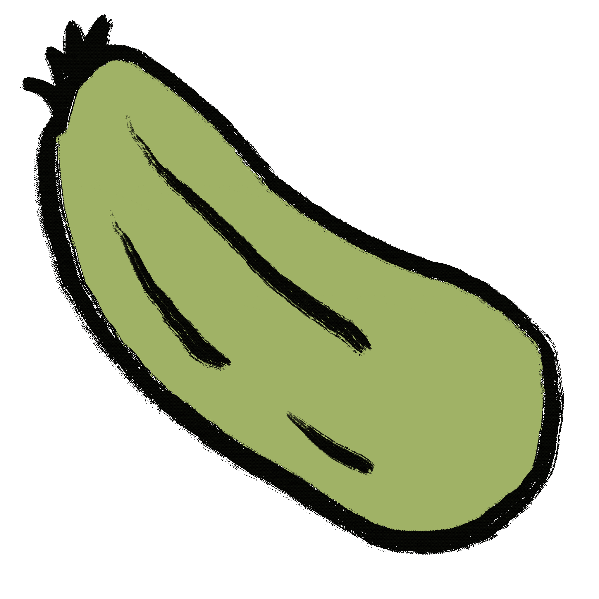
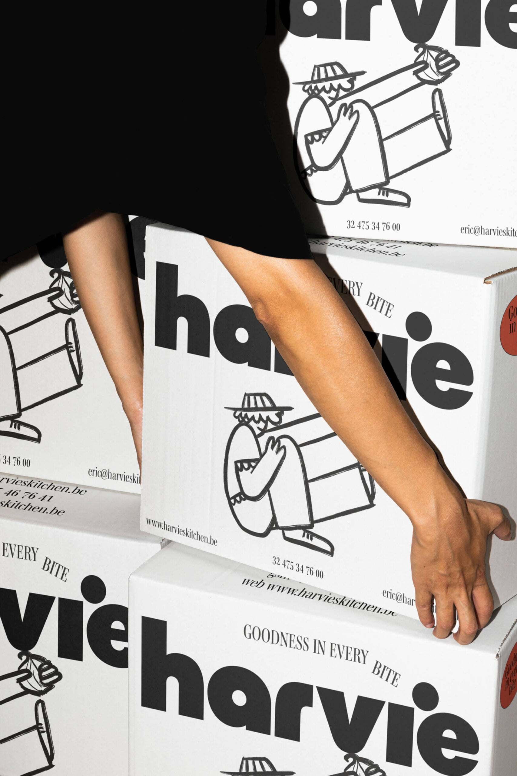
WILLY WONKY
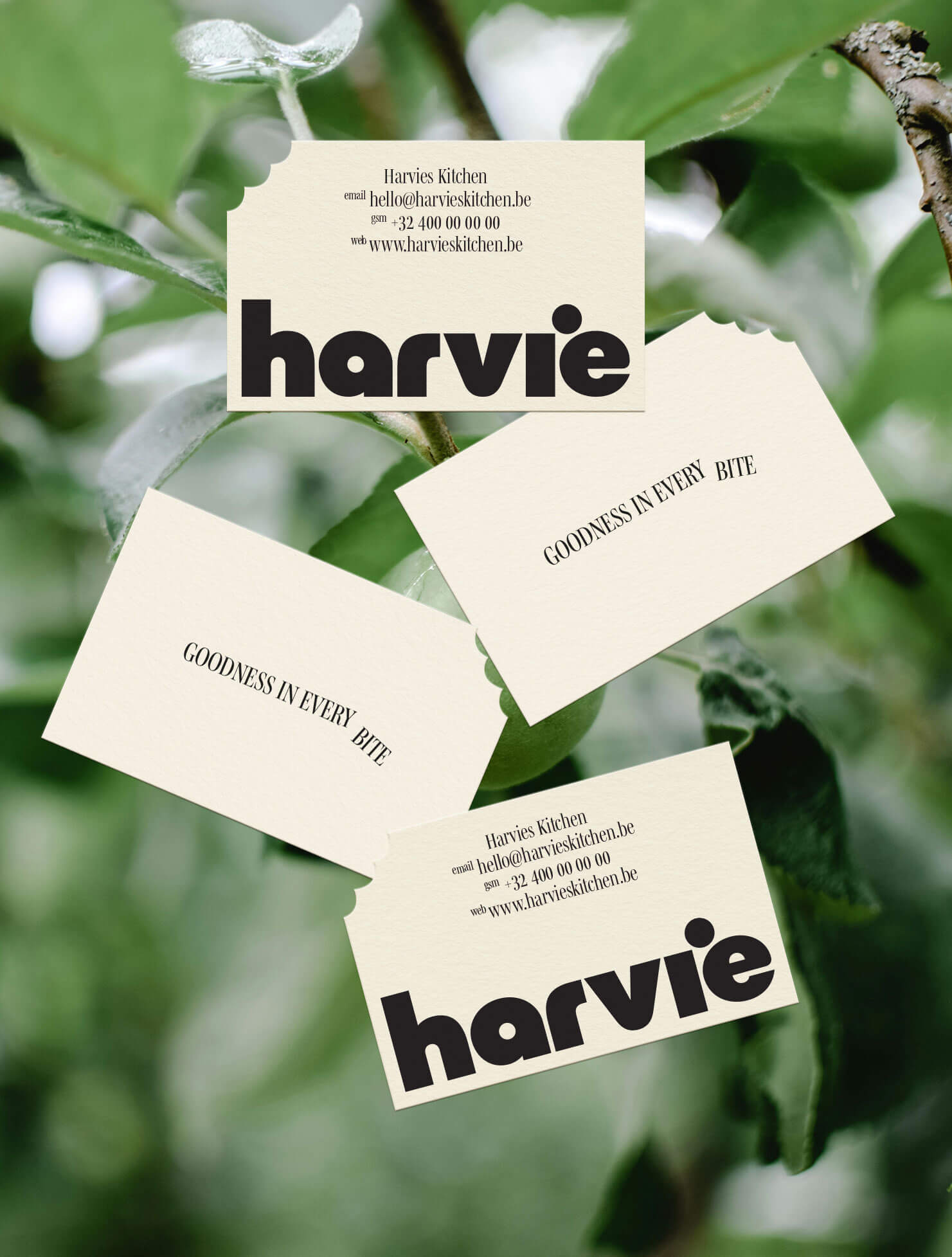
The identity for Harvie is a visual representation of the vegetables that didn’t make the cut. Their shape is unique and a bit quirky just like nature intended. By working with playful typography and uncommon layout choices we intended to emphasize this idea.
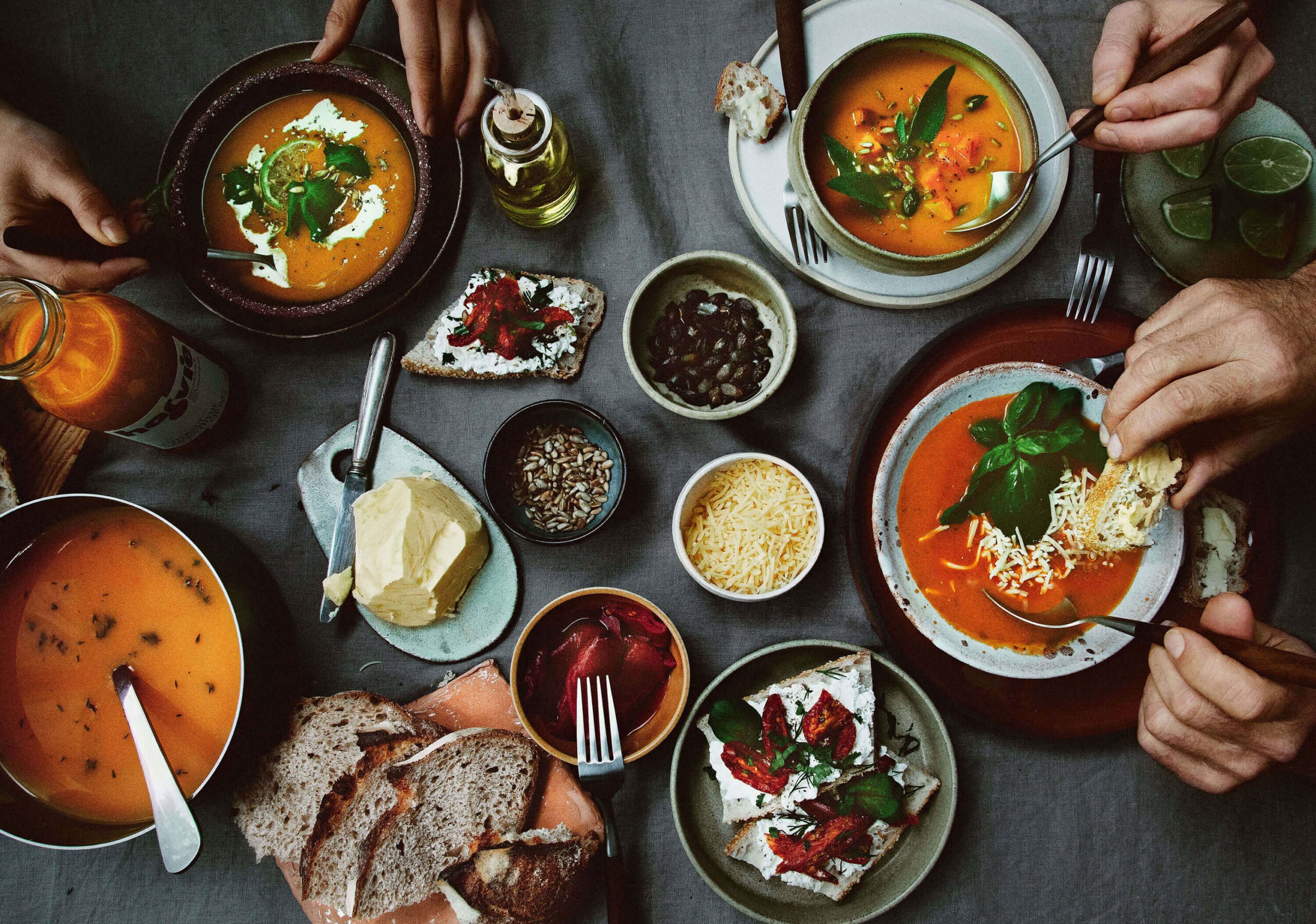
CAN I HAVE SOME
For the imagery and colors we focused on the joy and pure delight you experience when enjoying a bite of Harvie’s food.
We picked out bright hues inspired by their fresh ingredients combined with a comforting beige to provide a grounded, welcoming base—similar to how a great pizza begins with the perfect dough.
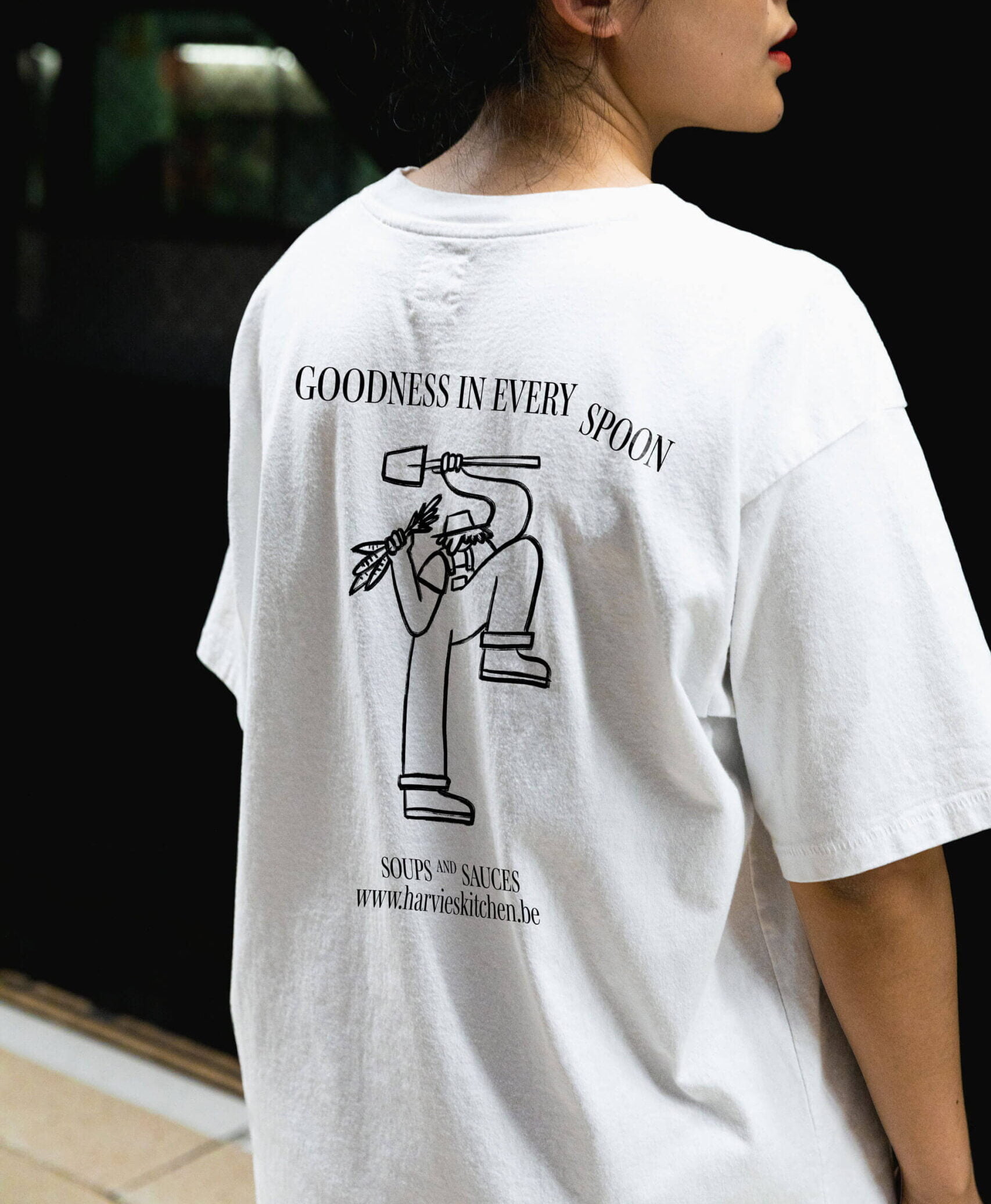
THE FARMERS
We brought their farming partners to life through illustrated characters, each designed with a whimsical twist—some feature oversized vegetables or tiny hats, others have remarkably bendy legs. This illustrative approach adds a lively and memorable element to the brand.
AT THE END
The entire identity system is bursting with happiness and has a clear and recognizable look.
We prove that sustainability can be engaging and fun, bringing much-needed attention to the issue of food waste.
CREDITS
Photography — Mana’s Food Stories