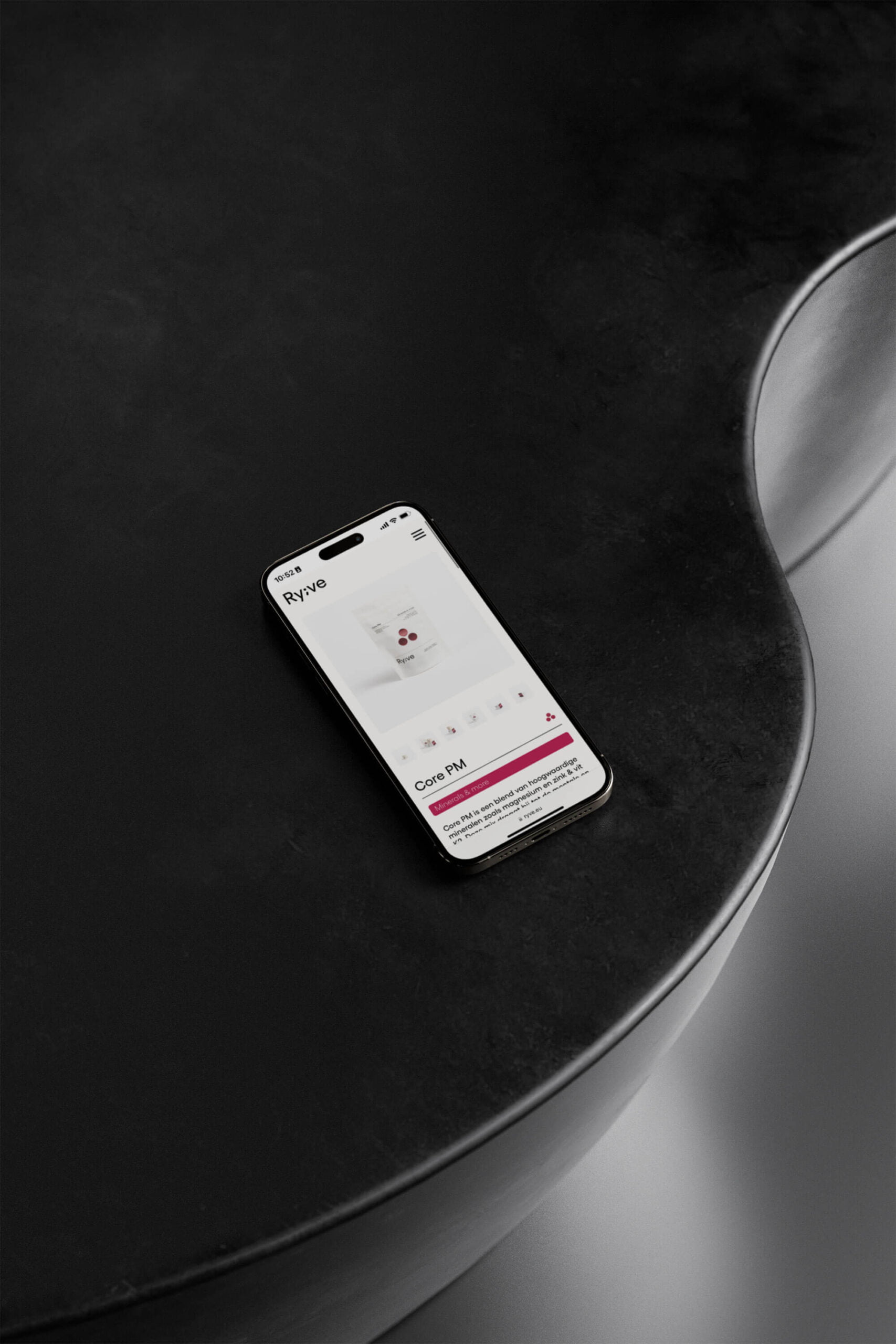
Ryve
- Brand Strategy
- Brand Identity
- Art Direction
- Touch Points
- Packaging
- Web Design
- Website
Year
2024
Facing personal struggles of reproductive health can be overwhelming, but Véronique and Rafaëlle turned their challenges into an inspiring movement. By sharing their knowledge, creating a safe haven and developing essential products, Ryve is transforming the future of reproductive health.
Year
2024
NO SMOOTH SAILING
Ryve understands that the journey to reproductive health is rarely smooth sailing, that’s why they’re committed to offering support to those on similar journeys. With a wealth of personal experiences, Véronique and Rafaëlle have created a community where it’s not just about overcoming obstacles; it’s about empowering each other through every step of the way.
THE GAP
In a world full of poorly dosed supplements housed in unappealing packaging, Ryve stands out as a clear solution. Seeing an obvious gap in the market, they boldly chased their vision — creating something truly life changing. But their dedication goes far beyond products; they deeply engage with their community, offering essential resources and support for better informed health decisions. This holistic approach is what sets Ryve apart in an industry that too often misses the mark on true care.
WHAT’S IN A NAME
The name Ryve speaks volumes about the brand’s journey and aspirations. It combines the two founders’ names, Rafaëlle and Véronique, for a personal touch but also refers to the French word “rêve” meaning “dream”. Because Ryve is not just about addressing challenges but also about nurturing dreams – dreams of building families, achieving hormonal balance and embracing life’s significant moments with confidence.
TRANSFORMING REALITIES
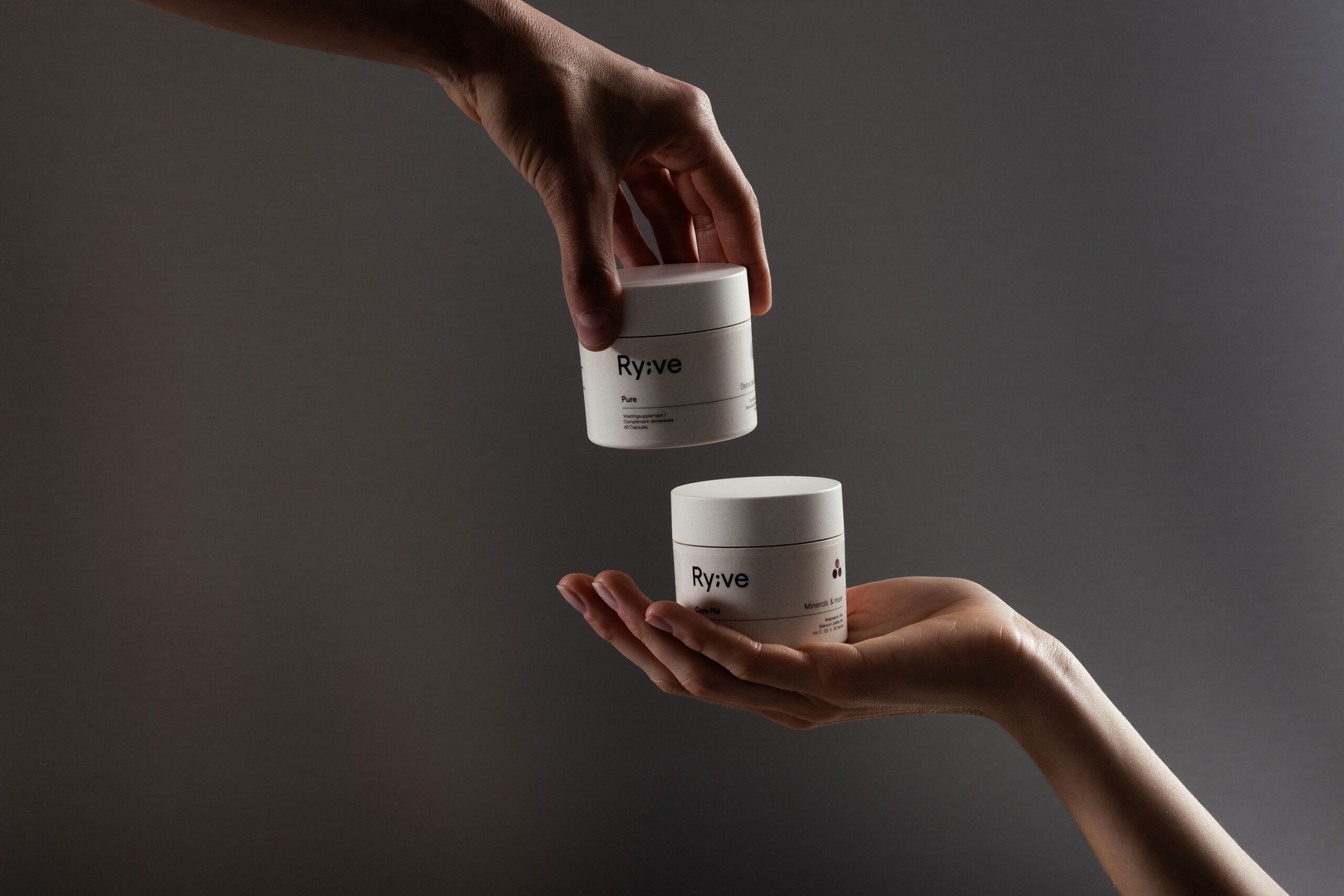
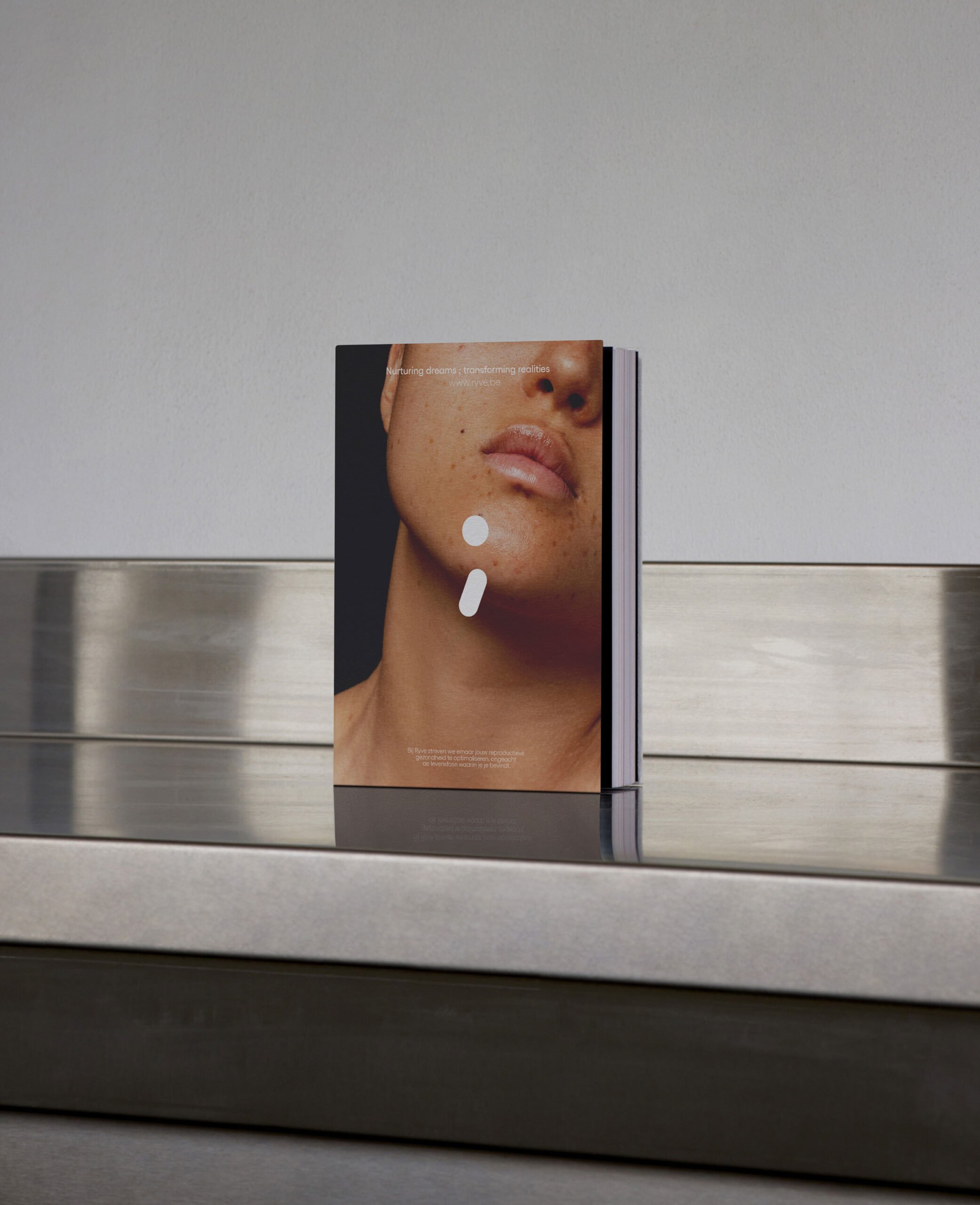
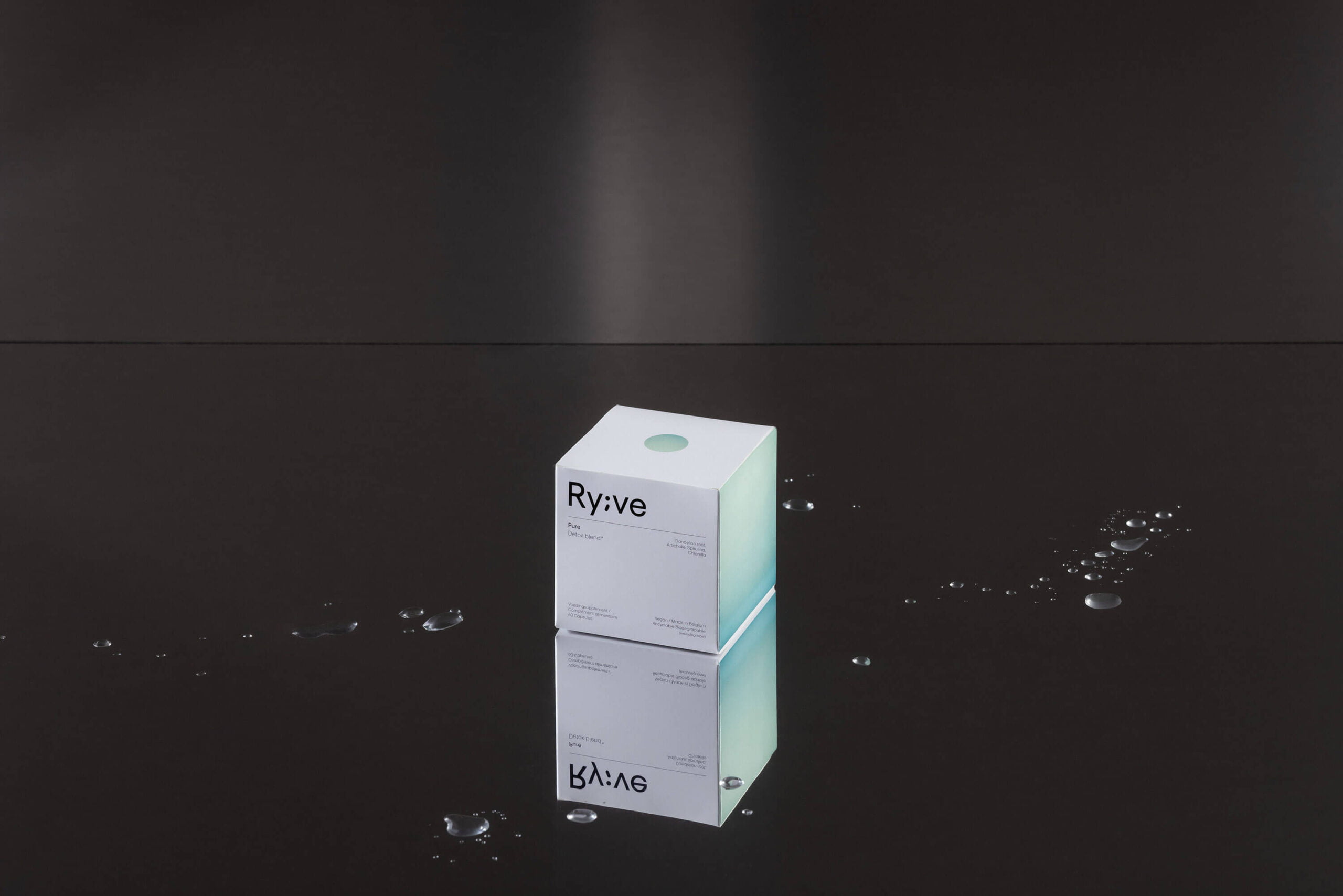
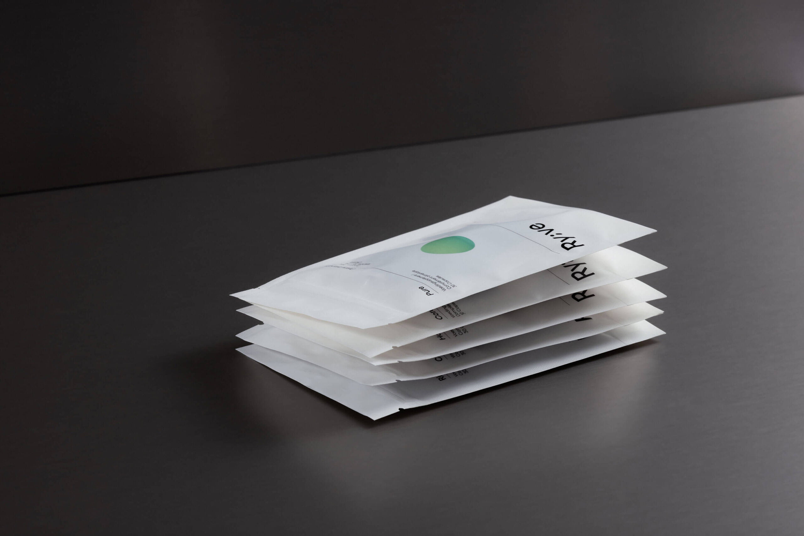
Acknowledging the sensitivity surrounding this topic, we knew it was essential to address it gently and warmly. Our main emphasis is on transformation, dreaming of a better future and supporting each other during tough times. This sense of connection is reflected in our artistic choices, focussing on round shapes, soft brand colors and fitting imagery.
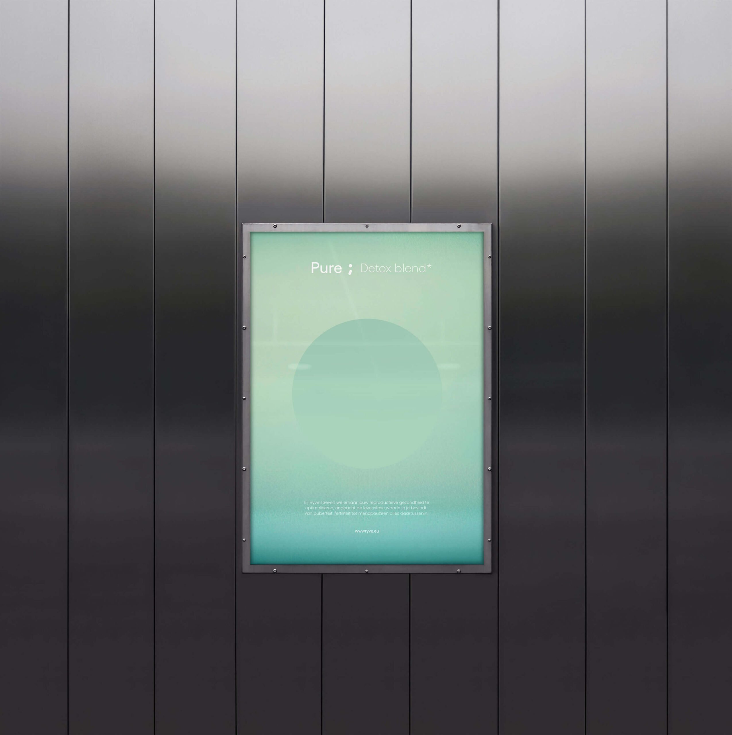
To capture the dreamy feel, we used colorful gradients alternating with primarily black and white. This ensures the brand truly stands out in the clinical market, as they genuinely do things differently.
THE BRANDMARK
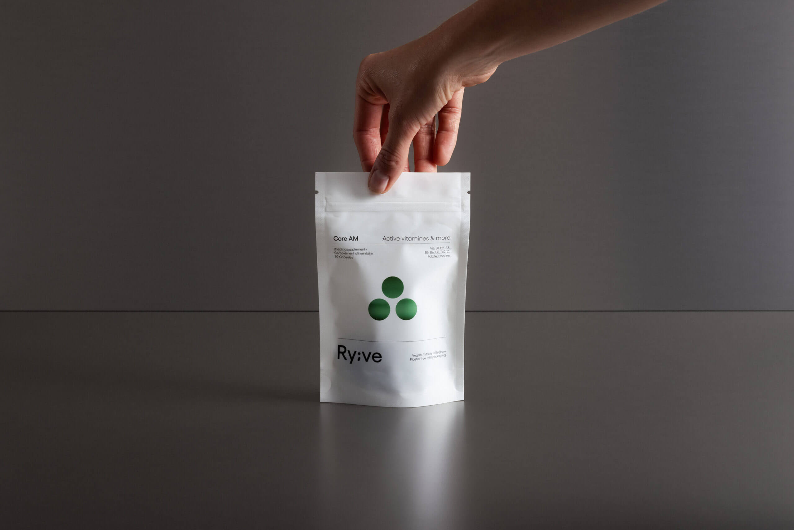
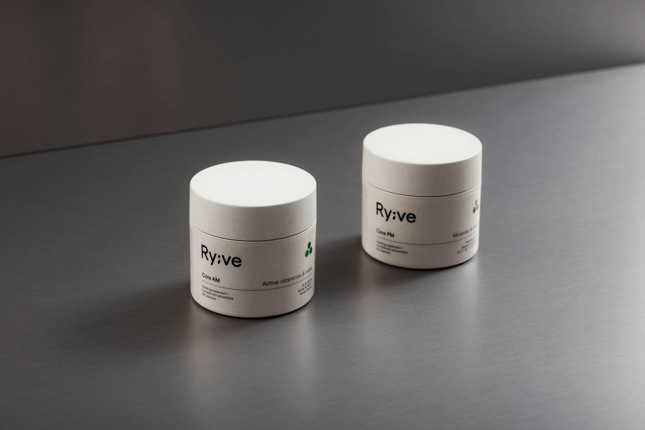
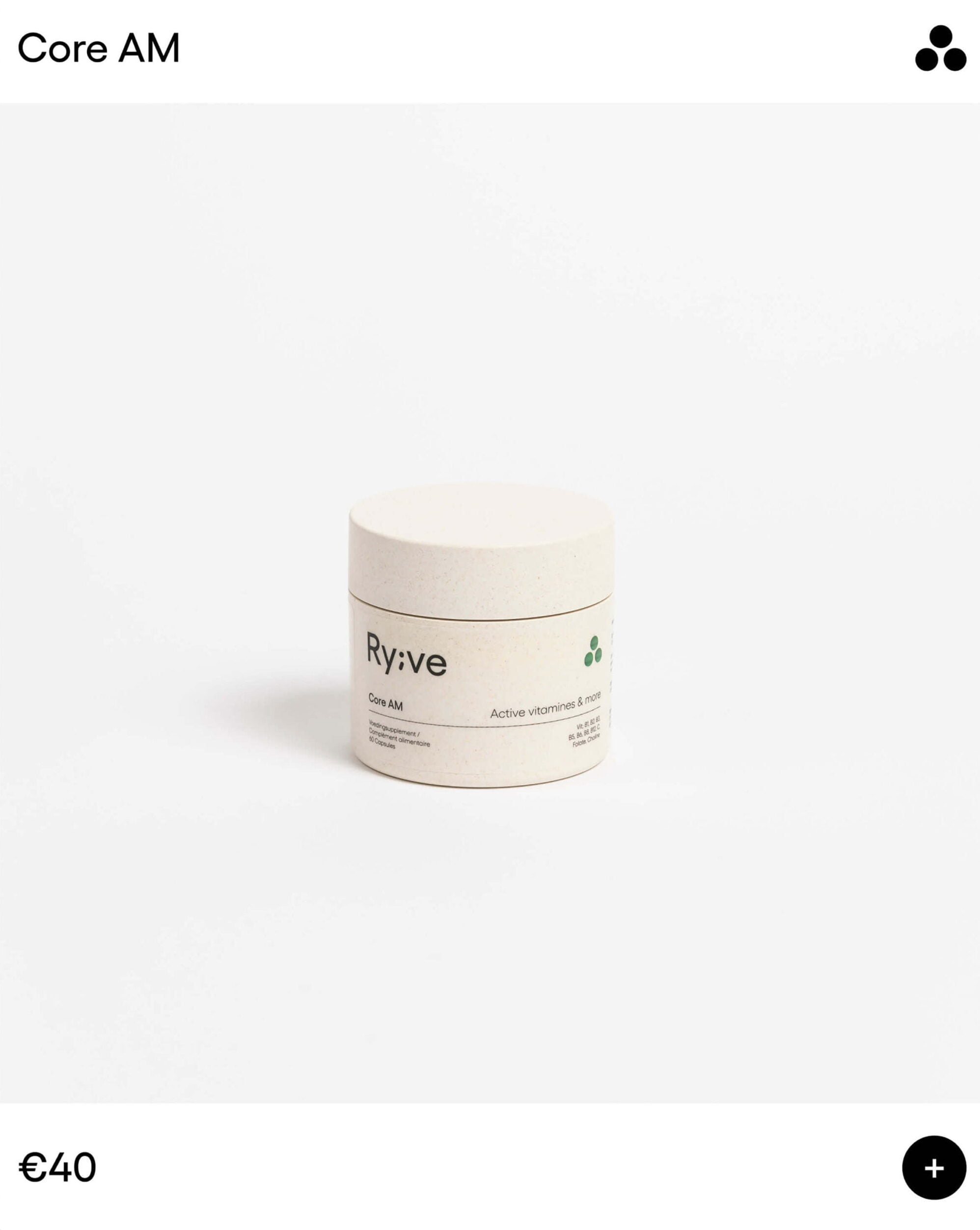
The semicolon symbol between “Ry” and “ve” is more than a nod to the accents in the founders’ names; it’s a statement. It emphasizes the words that follow or leaves room for future possibilities. This thoughtful design choice flows through the entire packaging, with additional symbols gracefully segmenting different categories of reproductive health.
